

Geospatial Analysis: Changing the Landscape of Healthcare Informatics by Moving Beyond Typical Business Intelligence Tools
By Lisa Smith, Lead Research Data Engineer at the Wilmot Cancer Institute, and Eric Snyder, Director Informatics at the Wilmot Cancer Institute
Enter Tableau
With its creation at Stanford University in 2003, a result of the work of Chris Stolte and two collaborators, and its subsequent launch in 2004, Tableau revolutionized data delivery [1]. In the early 2000’s research on decision making processes was becoming increasingly focused on the use of information to reduce uncertainties, and evidence-based management was developed, and as a result, evidence-based medicine. Evidence-based medicine is defined as “the conscientious, explicit and judicious use of current best evidence in making decisions,” a widely praised movement that reached clinical practice as well as healthcare management [2].
As the demand for data skyrocketed, healthcare information technology needed a product that could deliver graphical data to providers in an on-demand platform and Tableau delivered that in a user-friendly format. It allowed individuals with minimal technical or coding skills to design and present geospatial analysis of data drawn from multiple sources, in a browser setting. While data cleaning and preparation was still a complex process, once the data was connected, everything else was “point and click.” The low skill floor required for creation, coupled with the powerful analytics and high-impact user experience, is what set Tableau as the new standard for business intelligence (BI) platforms. It also quickly captured and continues to maintain a sizeable market share in the Business Intelligence Software space. According to SLINTEL.com, as of Jan 2023, Tableau Software is the Data Visualization market leader with over a 22% market share (including Tableau Desktop’s 3.71%) and the only product coming close is Microsoft Power BI (released in 2011), which holds a 17.71% market share [3].
Overall, CANVAS: Snapshot is a state-of-the-art geospatial analysis tool that has the potential to redefine expectations and standards in geospatial data visualization and has been utilized in support of multiple grants, research papers, and high priority initiatives across the cancer institute.
While Business Intelligence tools offer impressive analytics, there are also several costs of use:
- Data Use and Outcome Cost: In Healthcare (and many other industries), real time data is key to valuable analytics. Today’s electronic health record management (EHR) systems are extremely complicated, and curate data in such a way that it is often realistically impossible to provide a real-time, validated data feed to Tableau. In Healthcare, for example, data is fragmented and scattered across multiple, disparate systems. Reassembling that information into usable data to analyze and subsequently gain an understanding of patients, their environment, and the spread of disease is a multilayer jigsaw puzzle where each piece consists of another puzzle made of shards of glass. Therefore, most BI tools require an attached data source, which is, at best updated weekly or monthly. This directly undermines the advantages of evidence-based medicine being realized in real-time patient care.
- Opportunity Cost: Typically, ease of use comes at a cost to flexibility and customizability, and BI tools are no exception, this is most costly in the geospatial analytics tools. In general, their ability to deliver data visualizations in typical formats is stellar. However, while superficially impressive, it is quickly apparent that geospatial mapping capabilities are extremely limited, and not customizable. While relationships can be visualized via maps, they are limited by the fact that the regional boundaries are predefined and either impossible or extremely difficult to alter. For example, to geospatially analyze cancer incidence by watershed regions, a user must geocode that data themselves, or extend an existing geographic hierarchy, which requires a very high skill level, not typically possessed by typical users of these systems. Additionally, for frequently changing geographic regions, such as US zip code tract areas (zip codes) which change as by definition or as a result of the creation of new zip codes, the BI tools’ predefined boundaries are often out of date.
- Explicit Costs: Business Intelligence platforms require a significant and continual investment. According to statista.com, BI Software is currently a $25 billion industry, and with an annual growth rate approaching 6%, it is projected to reach over $34 billion by 2028. This year, the average spend per employee is estimated at $7.39 and is projected to reach $9.55 by 2028 [4]. For a research hospital with 50,000 employees, this equates to spending nearly $500,000 annually by 2028. In the current climate of rising costs, increasing salaries, and dwindling resources, when many organizations are relying on cost cutting measures, absorbing this ballooning cost indefinitely is unsustainable.
- Implicit Technical Cost: While the software itself has a low skill floor, the burden on IT resources and their necessary expertise remains high. In the healthcare space, HIPAA Privacy and Security Rules, which regulate the use, disclosure, and safeguarding of PHI, have made it necessary for BI systems to reside either on-premise or in extremely protected cloud environments, with the responsibility for integration and maintenance falling to internal IT staff. Specifically, server structure needs to be maintained, regular updates and vulnerability patches are required, and due to the oft web-based user-interface of the software, implementation at the enterprise level usually includes embedding into web applications to maintain integration with current technology.
Enter CANVAS: Snapshot
At the University of Rochester Medical Center’s Wilmot Cancer Institute, we have overcome the aforementioned data obstacles which typically plague the Healthcare setting by utilizing the Hyperion platform. Via Hyperion, we deliver real-time data and analytics in several, user-friendly applications, including our current geospatial analysis platform, CANVAS: Snapshot.
CANVAS: Snapshot was built using Leaflet, an open-source JavaScript library created by Volodymyr Agafonkin in 2011. It is free to use, modify and distribute, making it highly cost-effective for both small and large-scale projects. Leaflet has extensive documentation and a large community of contributors, giving creators access to a wealth of support and resources. Its simplicity and intuitive structure make it easy for developers of all levels to use, with a comprehensive API that enables rapid and effective development of geospatial analysis applications. Additionally, while not nearly the size of the BI market, the commercial Geographic Information System (GIS) market is expanding at a rate of 12.2% annually. The industry leaders, ArcGIS, and Mapbox, are expensive and require a relatively high skill level [6]. Leaflet’s combination of flexibility, accessibility, ease of use, and cost-effectiveness made it ideal for CANVAS: Snapshot.
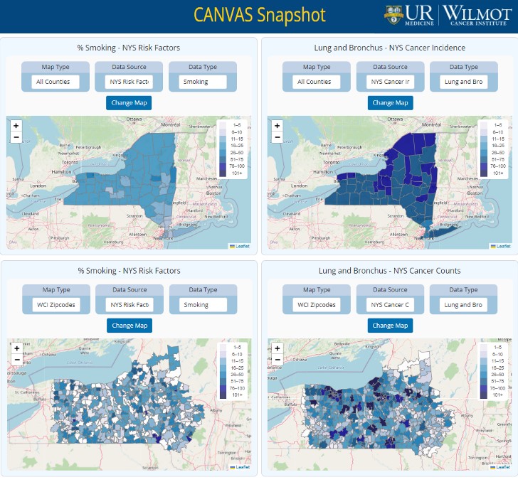
In the year since the system was brought live, CANVAS: Snapshot has been side by side with legacy Tableau and Power BI style geospatial analysis platforms and outperforms these platforms by a significant margin in responsiveness, accessibility, flexibility, and accuracy. In contrast to the typical geospatial application load times, Leaflet’s lightweight architecture coupled with the Hyperion data solution enables Snapshot to be quick loading, even on mobile devices, making it highly accessible to users on the go. At the same time, its flexibility and design maintain its high-quality, device agnostic user experience. CANVAS: Snapshot delivers unprecedented, real-time data, including Lung Cancer Incidence and Mortality rates, regional Smoking rates and other risk factors, together with social determinants of health visualized in multiple types of geographic regions by county and zip code. Because of the degree of control provided by the architecture, CANVAS: Snapshot offers users custom filters, allowing users to further investigate relationships and potential disparities based on Race, Sex, Age, and time frame of the data from multiple sources, displayed in multiple maps simultaneously. Every aspect of the maps is completely customizable, making Snapshot a highly adaptable platform for a variety of use cases. Further, the geographic regions can easily be changed to maintain accuracy or to define new geographic areas of interest. Similarly, filters, the number of maps displayed, and visualized data can be expanded, or changed as needed. All in real time, streaming from not only the EHR but multiple other data sources.
Overall, CANVAS: Snapshot is a state-of-the-art geospatial analysis tool that has the potential to redefine expectations and standards in geospatial data visualization and has been utilized in support of multiple grants, research papers, and high priority initiatives across the cancer institute.
Resources:
[1] https://www.tableau.com/blog/analyzing-history-tableau-innovation#:~:text=Tableau%20was%20born%20at%20Stanford,Chris’%20dissertation%20defense%20in%202003.
[2] https://doi.org/10.1007/s13132-022-00917-y
[3]https://www.slintel.com/tech/data-visualization/tableau-software-market-share
[4]https://www.statista.com/outlook/tmo/software/enterprise-software/business-intelligence-software/worldwide#revenue
[5]https://journals.plos.org/digitalhealth/article?id=10.1371/journal.pdig.0000036
[6]https://www.psmarketresearch.com/market-analysis/geographic-information-system-market